US vs. UK Covers
Hello everyone, and Welcome back to Cover to Cover! Today I wanted to talk about something I have been thinking about lately and that is US covers and UK covers. Often times books have different covers in different countries, and I wanted to know why but also to share side-by-sides of examples of different covers and judge them (I know the biggest no-no ever). Let's get right into it!
According to my research, there are different covers for different countries because market tastes differ. This seems to be the biggest reason why that I could find. Different market and cultural tastes means the cover has to change from country to country. What works in the US apparently won't work in the UK which makes sense. Plus, cover design is a hard part of the publishing process because while we all want to admit we don't judge a book by it's cover, we do. It has to appeal to the target audience.
British covers usually have darker colors or more negative space whereas American covers tend to be flashier.
Another thing is that American covers tend to show the characters on the cover. Real people. This is a big opinion in the Booktok world because a lot of people don't like that. Personally, I don't like it; I'd rather have some abstract art. I will let you be the judge when I show my examples below!
According to a New York-based book designer, Megan Wilson says, “When I go back to the U.K., I think they’re often more sophisticated and take more risks. I wonder if it’s because the market is so much smaller, versus our trying to reach such a broad audience.” She is referencing how the US market is always trying to reach more and more people.
As an American, I find this really interesting because I feel like I gravitate towards the UK covers more so than the covers literally marketed at me. But I mean, out of the ten covers I have selected to do a side-by-side I only picked the US four times, so is it really that big of a difference?
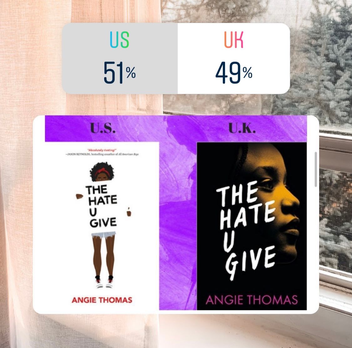
I have a few examples below of US and UK covers. All the US covers are on the left and UK covers on the right. I made some polls on my bookstagram to see what people tended to lean towards, so the results will be posted along with the pictures! If you want to follow my bookstagram I will have it linked here . I will also be giving my personal opinion. I also want to disclaim that I have read some of these books but not all.
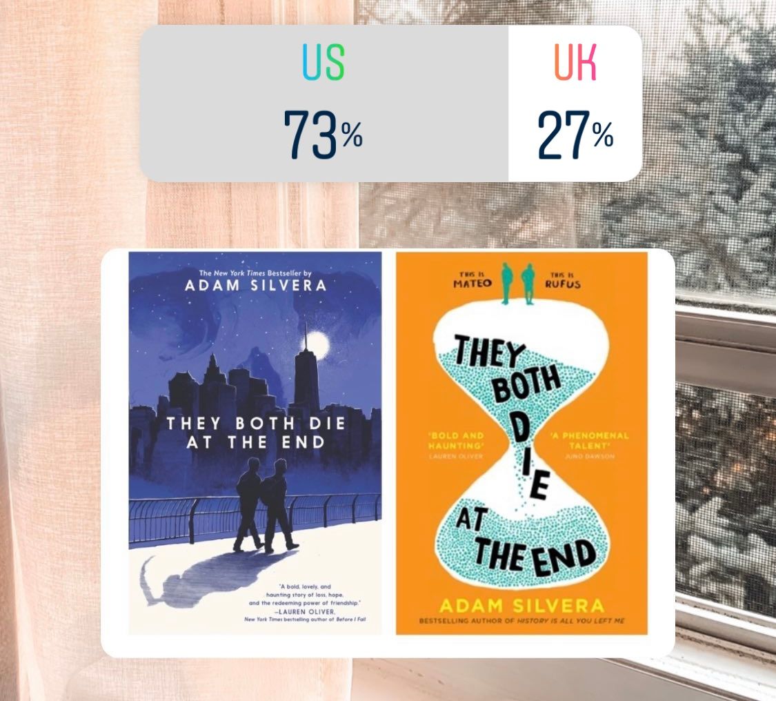
For this cover, I prefer the US version. I just like the fact that you can see a skull in the night sky and the grim reaper behind the two boys. I also did a whole analysis of this cover in college, so I guess I'm biased in that way. I also just prefer the darker blues to the bright orange.
I have to agree with the poll results; I think the while with the orange flames go really well together and it just stands out more. I just don't like the name placement at the bottom. It's almost a little too cluttered down there.
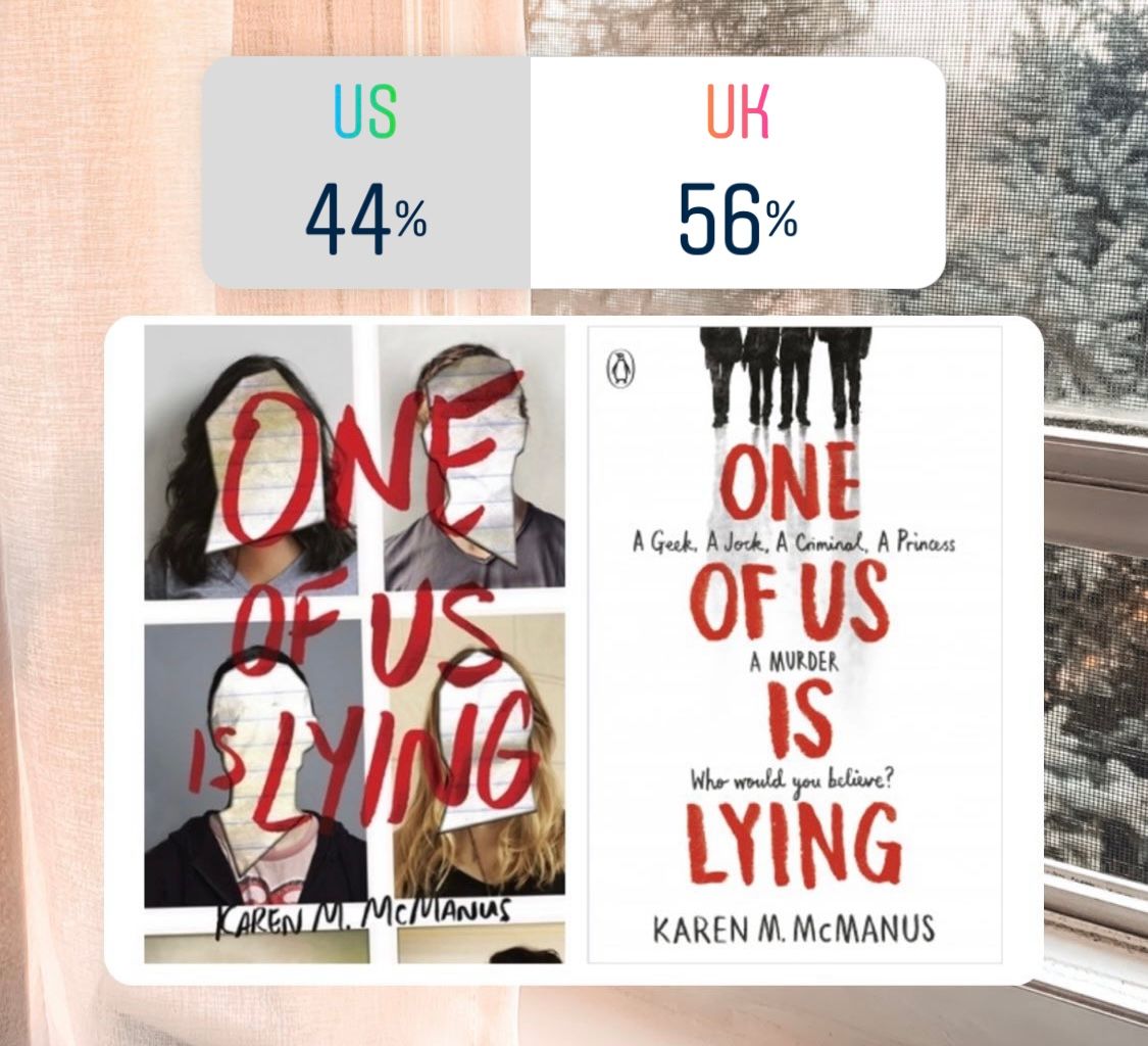
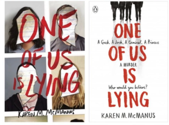
To be honest, I really like both of these covers. I don't mind the US one mostly because the faces are blocked out. The UK does stand out more to me though because of the white space and the stark contrast of colors. Overall, I would have to go UK.
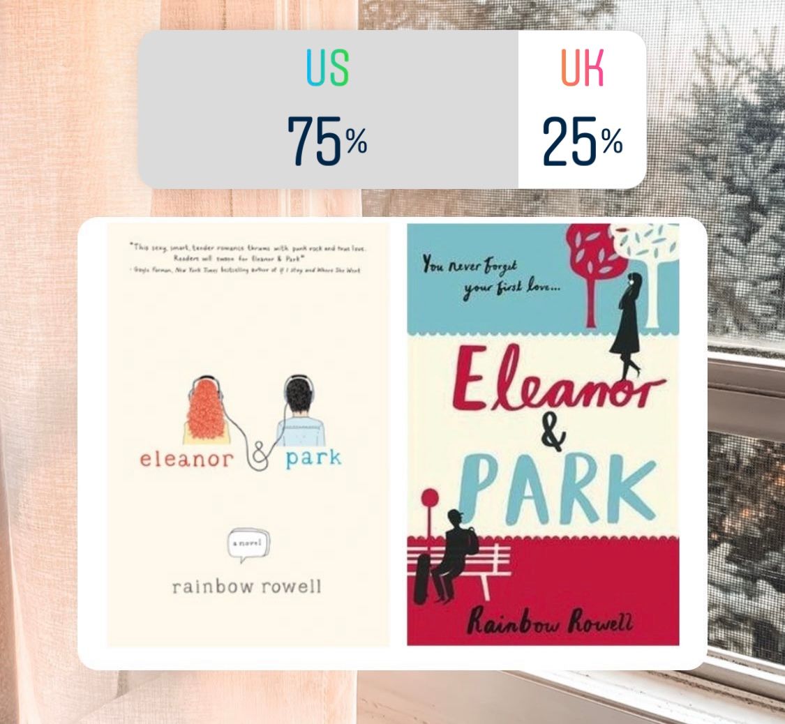
Again, I agree with the poll. I like the simplicity of the US cover. I don't like the reddish-pink and the blue of the UK cover.
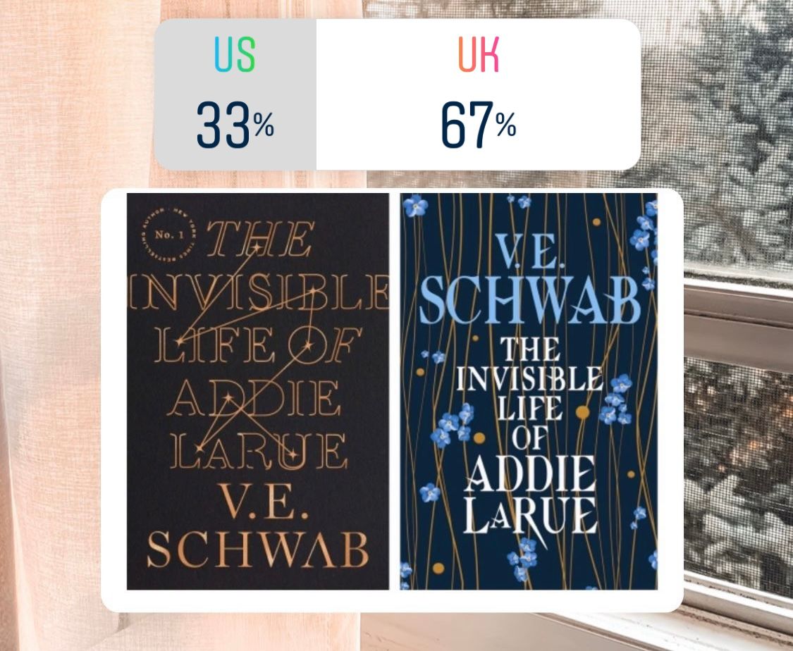
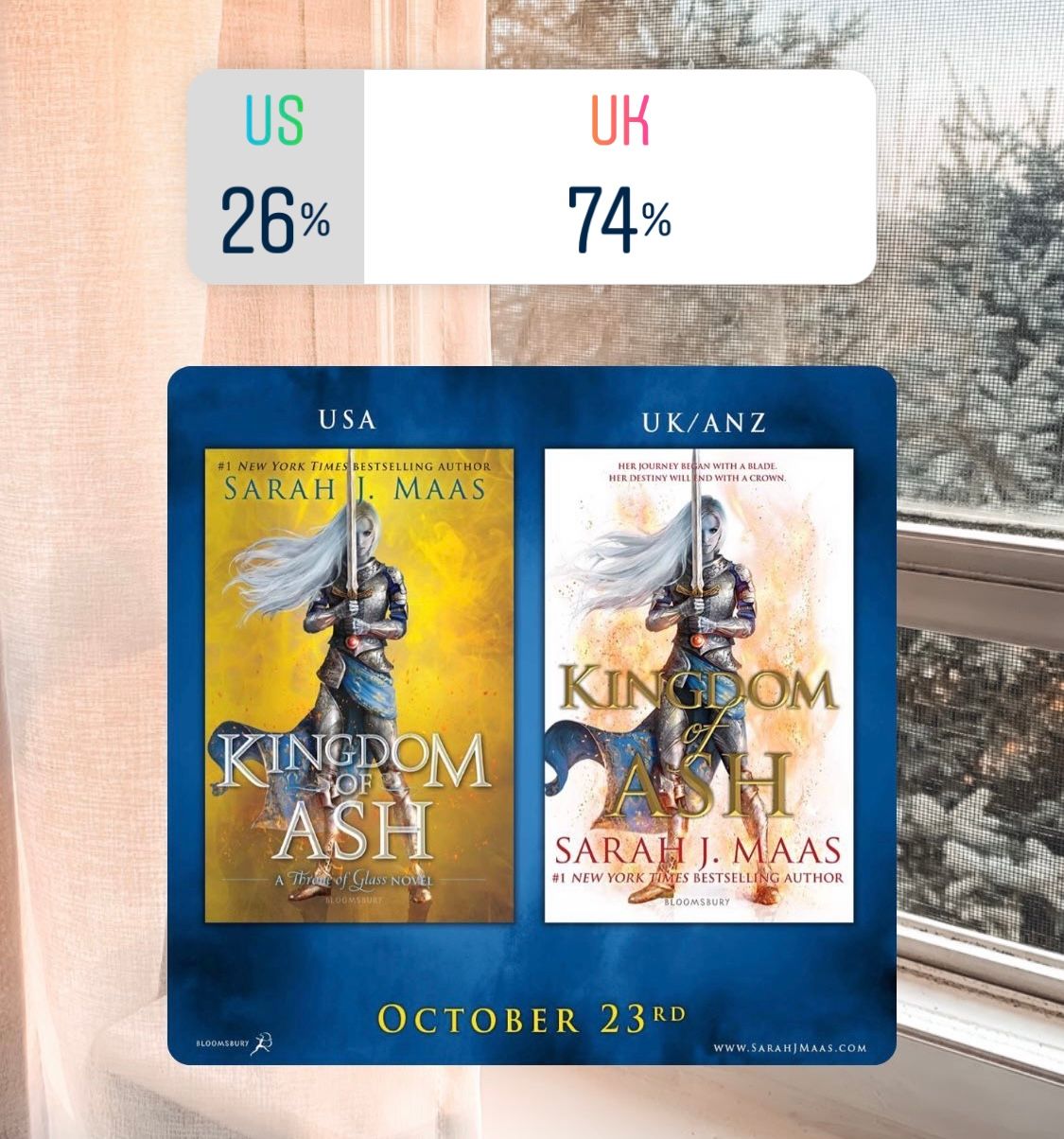
This one shouldn't even be a question. The UK cover is SO beautiful. I love the colors and the art. I think it all goes really well together. While the stars and constellation are cool on the US cover, I just think it looks really muted and boring.
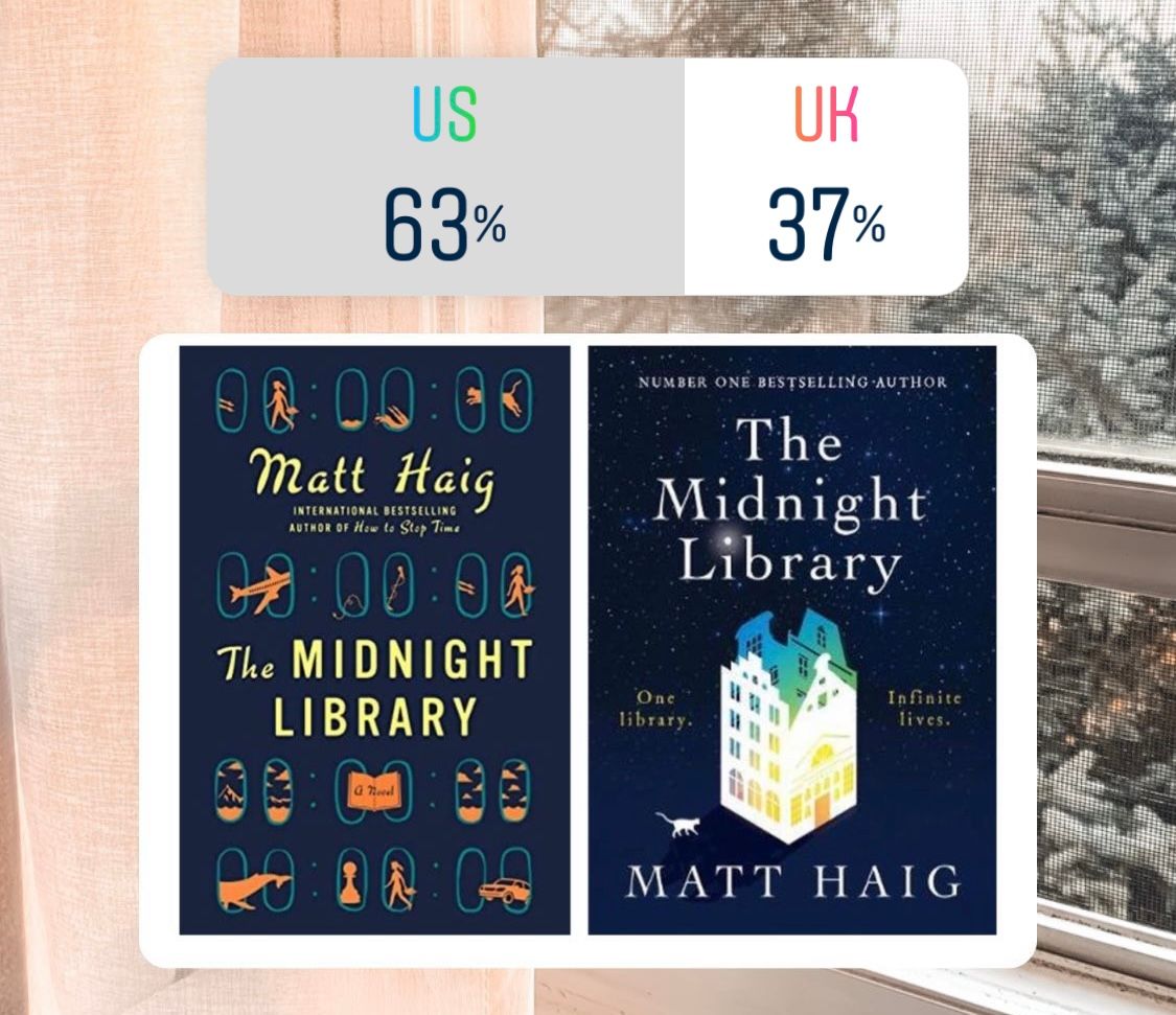
I love the US cover. Again the colors just really vibe together, it's simple and not overpowering. It takes up just enough space on the cover. I'm not a big fan of the subtle rainbow; I just don't know something about it throws me off a little.
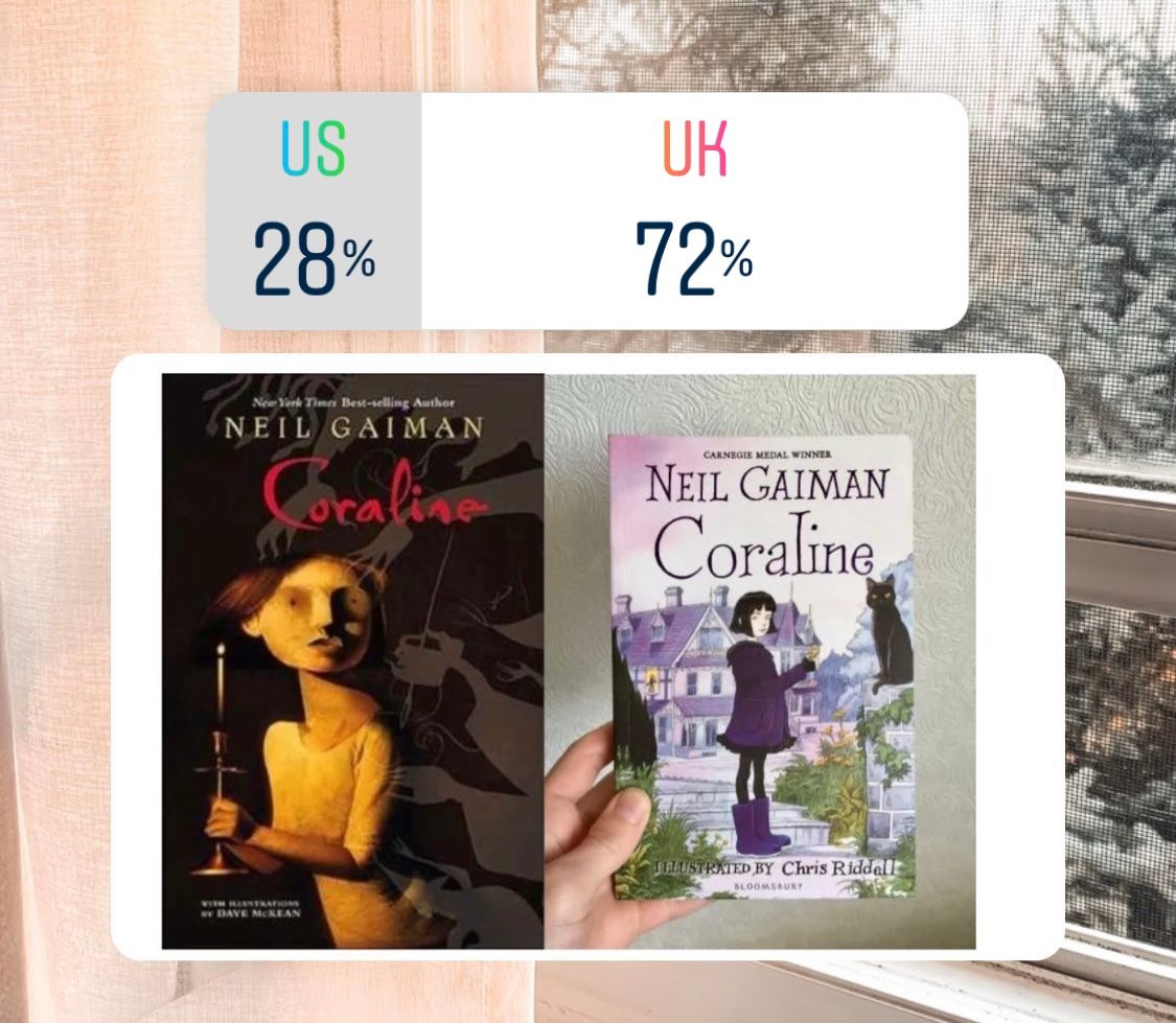
Can we talk about how scary the US cover looks?? Coraline looks like the scariest wooden doll (?) I've ever seen. Not a fan at all. I really like the cartoon look of the UK cover. I think it embodies the quirkiness of the novel.

Here is perfect example of US covers using real people/characters on the cover. And like with most of the UK covers, you can prominently see a lot of negative space. I honestly don't care for either but I would say UK.
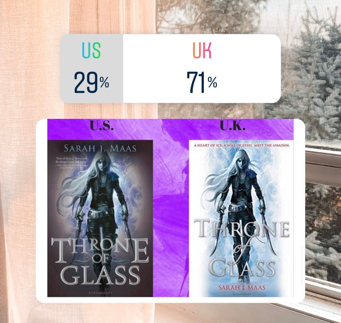
This is similar to the Kingdom of Ash novel where the US is darker and the UK is lighter. And for the same reason, I am going to the UK version. I just like the way the colors contrast better than on the darker background.
And lastly, I am agreeing with the poll results. I like the simple cartoon version of the US cover better.
Overall, I just find the cover variances so interesting and I feel like this is something the book community doesn't really talk about. But as of recently, it's something I have been thinking about, and I wanted to not only share my opinion but to give insight on why cover differences happen.
Alright, folks, that's all I have for this week! Be sure to come back next Tuesday for another blog post! As always, thank you for reading :)